


What is summer without a bit (or a lot) of colour?
As much as I love the Substack community, I sometimes feel like I don’t quite belong. I know many people here aren’t as drawn to colour as I am, and there often seems to be this idea that the less colour you wear, the more polished and chic an outfit looks.
I don’t think that’s true at all.
Thankfully, just as I was starting to doubt myself, the wonderful Xue published her latest newsletter, All I Want This Summer Is Colour. I devoured it immediately, and it reminded me that there are, in fact, other people here who love colour just as much as I do.


Look at this rainbow! Some substackers who make a strong case for colour like Asta, Ritika , Kelly Klein, Usha Fanny Adams and Melissa Asquith just to name a few!
So I thought I’d share some of my favourite colour combinations right now—some I’ve already tried and others that are still on my list. What I love about all of them is that they transition beautifully into autumn. With the right fabrics, layers, and accessories, they don’t feel tied to one season—they simply evolve with your wardrobe.
Swap linen for knitwear, add suede or leather accessories, and these palettes work just as well in October and November as they do at the height of summer. That’s what makes them feel like smart wardrobe investments rather than trend-driven colour pairings you’ll only wear for a few months.
1. Navy + Turquoise + a Pop of Yellow or Orange
I blame Jacquemus Spring/Summer 2027 collection for my current obsession with turquoise and his ability to make this colour feel so modern and chic.
The funny thing is, while I was writing this, I couldn’t decide which colours I like best with turquoise (or what sometimes reads as a very light blue). So instead, I thought I’d share the combination I’m currently loving—and one I’m hoping to recreate myself soon.
Navy acts as the perfect neutral, while turquoise adds freshness without creating a high-contrast look. It’s colourful enough to feel interesting but subtle enough if you’re someone who doesn’t usually wear a lot of colour.
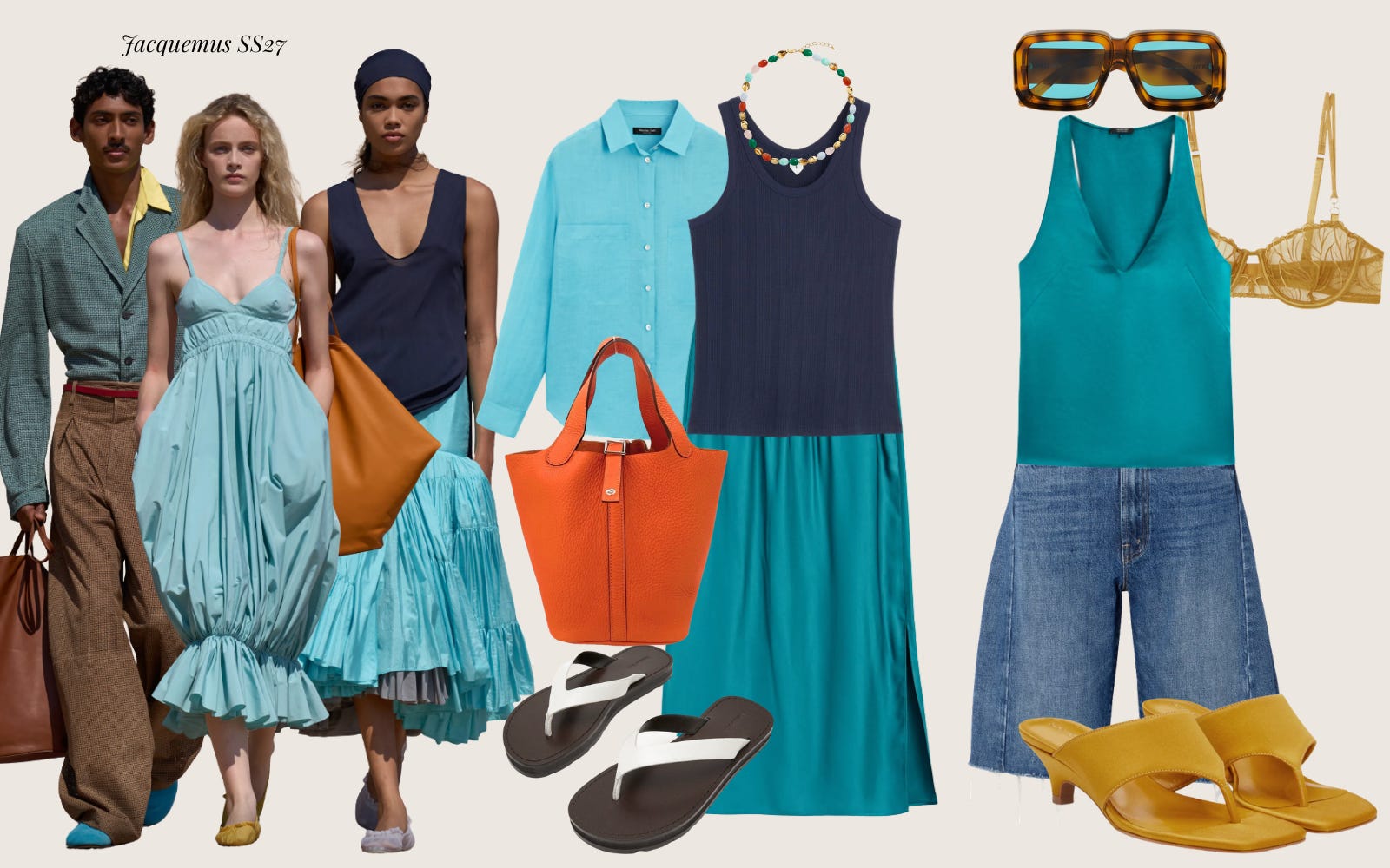
If you want to make the palette a little more playful, add a pop of yellow or orange through your accessories, or let a bra peek through a sheer shirt. It instantly brightens the outfit without overpowering it.
And if that feels like one colour too many, simply skip the accent and finish the look with white accessories—especially white sandals—for a crisp, polished summer outfit.
2. Chartreuse + Brown
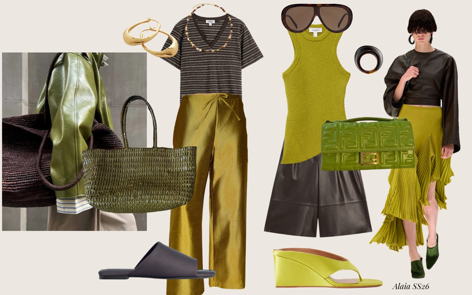
This colour has been around for a while now, although I feel like it’s evolved into everything from chartreuse to apple green to lime. Whatever you want to call it, you know exactly the shade I’m talking about.
Yep, the colour of those infamous Donni pants that have caused quite a stir on Substack. Some people love them, some hate them because they can't justify the price (but secretly love them... me included), and others simply don't understand the hype (me also!). They've been the star of countless newsletters, Notes, and weekly outfit roundups, and I'd bet my Bottega bag that most of us have linked to them—or, at the very least, have them sitting on a ShopMy shelf.
What I do think they’ve done is convince us all that this slightly odd green has become a neutral in its own right. Just look at Ritika’s DD green bag—it somehow works with absolutely everything. Even the very queen of neutrals Anna Newton reaches for this shade when she wants to inject a little colour into her outfits. That says it all.
I recently made myself a pair of shorts (at the cost of a lot of sweat and a few tears) from a beautiful fabric I found in Japan. The moment I saw it, I thought of the Donni pants and decided I was finally going to make my own pair. Then I realised I’d bought just enough fabric for shorts instead. A classic
ewing lesson in optimism versus reality.
One of my favourite ways to wear this colour is with brown. The richness of brown grounds the brightness of chartreuse, making the whole combination feel sophisticated rather than loud. It’s just as striking in summer with lightweight fabrics as it is in autumn with suede, leather, and chunky knits.
3. Red + Lilac
If red and pink is now an established colour combination, consider red and lilac their slightly more sophisticated cousin.
We first spotted it at Prada SS26 and more recently in Chanel’s Couture collection, where a red bra peeking through a soft lilac dress became one of those styling moments you can’t stop thinking about.
What I love about this pairing is that it has the same playful energy as red and pink, but with a little more contrast and depth. The coolness of lilac softens the intensity of red, creating a combination that feels unexpected yet incredibly elegant.
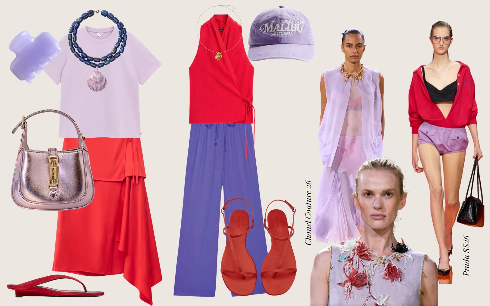
If wearing both colours head-to-toe feels like too much, start small. A red bag with a lilac dress, a lilac tee with a red skirt, or even a flash of red underneath a sheer lilac blouse can have the same effect. Sometimes it’s those little styling details that make an outfit feel fresh.
Like the other colour combinations in this post, this one isn’t reserved for summer. As the seasons change, simply swap airy fabrics for richer textures—cashmere, suede, wool, or leather—and the palette feels just as beautiful in autumn.
Whether you are someone who lives in colour like me or you’re just looking for a new way to wear it, I hope these combinations inspire you to experiment a little this summer. The best outfits aren’t always the safest ones, and sometimes all it takes is one unexpected colour pairing to make pieces you already own feel completely new.
Now I’d love to know—which combination is your favourite? Or is there one you’re wearing this season that I should add to my list?
Love,
Noelia x
How to Look Good When It’s Too Hot to Care

I love dressing for summer, but I know it’s not everyone’s favourite season.
3 Easy Swaps to Get Your Wardrobe Into Summer Mode Part 1

Every year, as soon as summer appears on the horizon, we all seem to forget we’ve lived through summer before.
Style is Not a Reward for Shrinking: A Conversation

Back in February I wrote Style Is Not a Reward for Shrinking. I wasn’t entirely sure about publishing it.
I love these colour combos! Thank you for including me in your rainbow line up!
I am also a fellow colour lover! Turquiose is one of my absolute faves! But, Kelly Green will forever have my heart.